The Colors You’ll See Everywhere in 2016
Meet Serenity and Rose Quartz
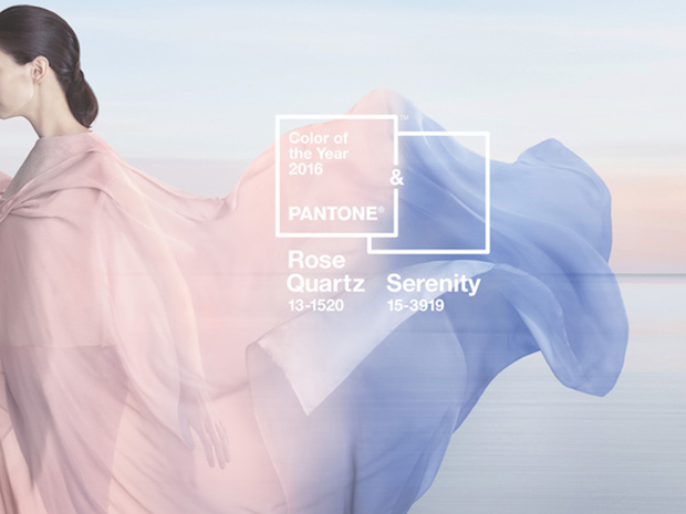
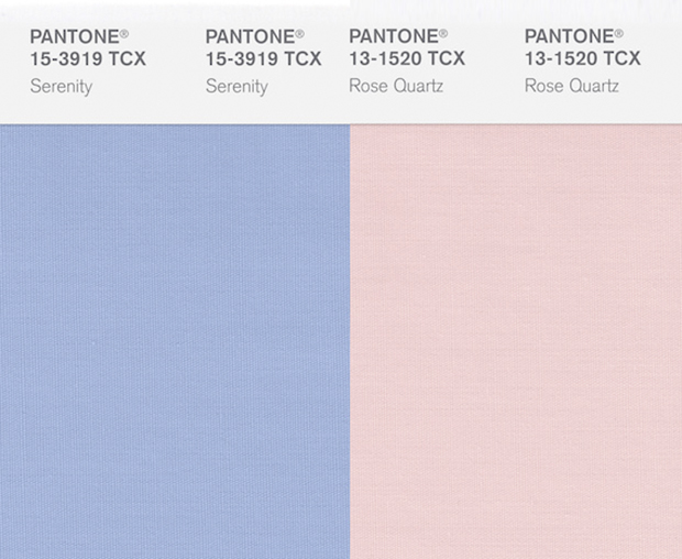
On December 3, news broke out that Pantone officially announced its selection for Color (or in this case, Colors) of the Year 2016, and they are Serenity (Pantone 13-3919) and Rose Quartz (Pantone 13-1520)—or to the general masses not trained in design, they may be known as baby pink and baby blue. This is the first time ever in Pantone history that two colors are sharing the coveted Color of the Year title. The decision to choose two colors was explained in a statement by Pantone’s team of color experts: “Weightless and airy, like the expanse of the blue sky above us, Serenity comforts with a calming effect, bringing feelings of respite and relaxation even in turbulent times. Rose Quartz is a persuasive yet gentle tone that conveys compassion and a sense of composure.”
A Softer Take on Color
The news of the Color of the Year was a pleasant surprise, as the light and graceful colors presented this year are a blunt contrast from last year’s pick of Marsala (Pantone 18-1438), a deep, earthy wine color. In a press statement released by Pantone’s color expert, the Colors of the Year come about as they “comb the world looking for new color influences” derived from “the entertainment industry and films in production, traveling art collections and new artists, fashion, all areas of design, popular travel destinations, as well as new lifestyles, play styles, and socio-economic conditions and more.”
For those of you who do not know, Pantone is a universal color matching system (known as Pantone Matching System or PMS) adopted by graphic, print, and fashion designers. This allows designers to “color match” specific colors during the production stage with different manufacturers by referring to the Pantone system.
“Just colors,” one might say, but before you roll this piece of information off your shoulders thinking it possibly doesn’t affect you, just watch the clip of Miranda Priestly explaining how “that color represents millions of dollars and countless jobs,” in The Devil Wears Prada. These colors are in fact pretty influential. “In many parts of the world we are experiencing a gender blur as it relates to fashion,” explains Leatrice Eiseman, executive director of the Pantone Color Institute.
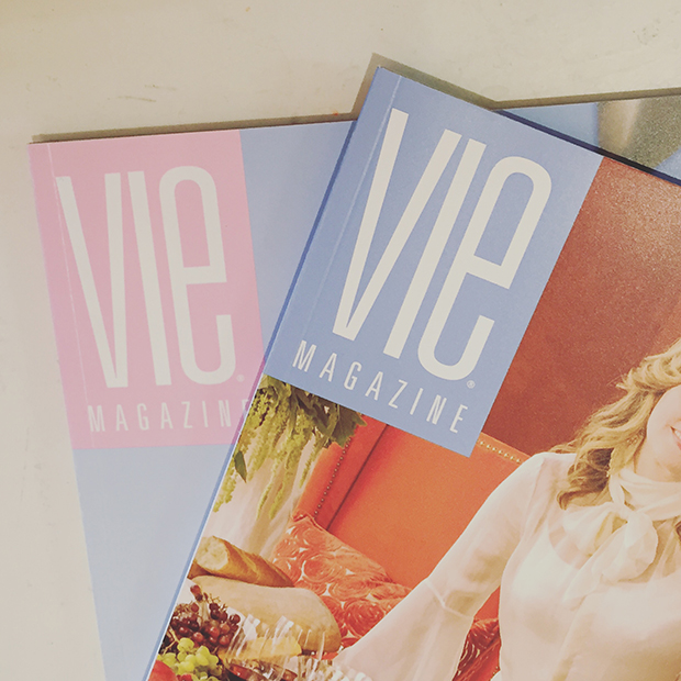
We are seeing these colors pop more and more—as a playful hair trend, in the fashion and cosmetics industries, and even on our VIE magazines, such as the March/April 2014 and May/June 2014 issues, proving that we are on top of the game!
Get ready for a year of these soft, calming tones, because pastels have reemerged in the design world!