8 Common Design Mistakes to Avoid
All graphic designers at one point or another will get caught up in a sticky situation. At the time, depending on what the offense is, it can feel damaging and take hours to repair. The best way to go about fixing the mistake is to treat it like a learning experience and never commit the crime again, or learn from us now! In the hopes that this will prevent such situations, here are eight common design mistakes to avoid:

With the advantage of the internet, there are many websites that will allow you to download fonts for free—but be aware of terms of usage and the legalities among them, as many require a purchase fee for business use. Should you choose to use a downloaded a free font for use in professional projects, you may want to read the typography designer’s terms (they should come with your download) before going through with your design only to find that you need to rework it. Alternatively, consider a budget for font purchase to save the hassle.


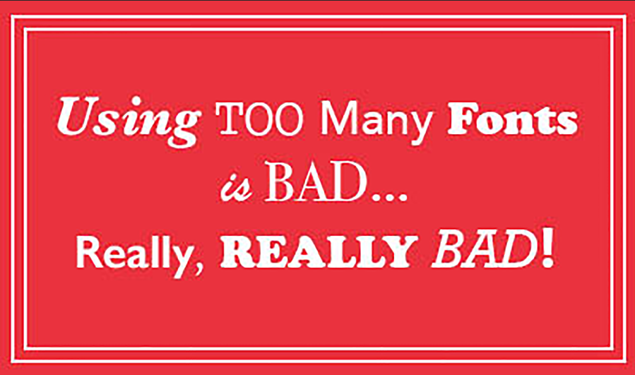
Fonts can be fun to look at and play around with. After going through your whole font library, it may be hard to pick one or two that you’d like to use, so you might as well pick them all, right? Of course we’re just kidding! As a rule of thumb, try sticking to two different fonts that work well together, and play around with the font weights to keep them balanced. Also, try keeping the content of your design in mind. Although you may have found two fonts that match each other, if they don’t match the content your viewers will be completely confused. Look at the design above as a reminder that having too many fonts in one design is bad—really really bad!

The lure of stock images can be enticing, especially if you can’t afford models, a professional photographer, or set props; however, stock photography can become overly used. Remember, if you like the photograph, chances are others will want to use it, too. Think of how many vacation or wedding brochures you’ve seen with the same stock images. Rather than risk taking away the originality of your design, try to limit your stock photo use.

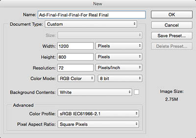
We can’t stress this enough. This is just as bad as not naming your file correctly (which is our next tip). Not naming the layers of your design during production, can mean more hours of work, especially if you’re passing it off to another designer to work on later. It can also be your one-way ticket to a designer’s fury!


Again, this can be a huge time waster. Without a standard format for naming files, you risk spending minutes or even hours trying to figure out where you saved a project, or just trying to find that one file. We suggest building a pattern and sticking to it. You can find this and other helpful tips in our blog post “10 Commandments of Adobe Suites.”

Do it once, it’s a lesson learned. Do it twice, shame on you! We’re talking about making irreversible adjustments to a file image. There’s nothing worse than resizing or completely editing an image only to save over the original file without a duplicate available. Always duplicate, use “Save As,” or use layer masks for safe keepings.

Spellcheck can only help you so much, as it’s great for finding misspelled words, but it’s not a great grammar checker. For example, it’s not going to catch common mistakes like using “their” instead of “they’re” or “your” instead of “you’re.” This is why you should always have a fresh set of eyes (and ideally a proofreader on staff) to check your work.


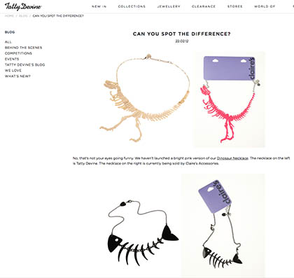
Nobody likes a copycat. The whole point of being in the design world is to show off your originality, and design plagiarism is an invitation to backlash and a trip to your lawyer. Take the case of independent accessory designer Tatty Devine and Claire’s Accessories, for example. Don’t get caught up in a legal firestorm and lose your credibility. Stay authentic and your work will shine!
That concludes our list of common design mistakes. Can you think of any common ones that didn’t make the list? Drop us a line or let us know what you think!


